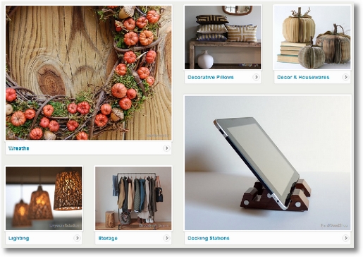
Have you seen the new Etsy “browse pages” layout?
What about the new Home Page?
I happened upon a totally new home page today that then vanished! Poof! I’m guessing it was just a quick test of something they’ll be rolling out very soon. It is very different!
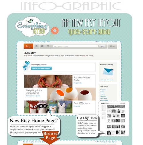
We created a little infographic to point out some new stuff and to help etsy sellers get used to the new layout. You can see that here.
I also prepared the following quick-start guide to helping you get the most mileage from the opportunities this new layout brings along with it.
1. Photography Rules

We’ve always talked about how important photography was to success selling on Etsy. Well, that just took on a whole new meaning.
The entire purpose behind this redesign is to get shoppers to browse more. AKA – more clicks on the site. Etsy has been watching this for awhile and they found that (no surprise here) people click on the pictures. So, to get more clicks and keep people browsing longer, Etsy redesigned to use more pictures.
But they can’t use just any ol’ picture. It has to be beautiful. It has to be engaging.
If you think your pictures are good enough, you’re wrong. Never, ever, ever stop working on getting better pictures.
Here are some resources to help you get great pictures.
- How to Photograph Your Work for Sale on Etsy
- Etsy Success Product Photography for Beginners
- Etsy’s Guide to Photography
2. Pay Attention to Categories and Sub-Categories
Do you ever scratch your head and wonder what people will buy? Well wonder no more because Etsy has done all the heavy lifting for you. The answer is plain to see.
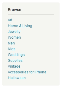
 Just look at what categories Etsy has chosen for the new Browse Pages…
- Art
- Home & Living
- Jewelry
- Women
- Men
- Kids
- Weddings
- Supplies
- Vintage
- Accessories for iPhone
- Halloween
The last two on the list are probably part of an in-house experiment. They show ‘Accessories for iPhone’ to one person and then something else to the next. Experiment or not, there must be a big market for that or it wouldn’t be there.
Which of those top-level categories fits your shop? Which could you make your shop fit within if you had to make some changes? Being outside of all major categories will usually mean more of an uphill battle for you. Try to be in one of these groups.
Then look deeper. Click on Kids for example (will open new window). The next browse page will take you to a more detailed grouping of more fine-tuned categories. Such as:
- Costumes: Capes (it’s October 11 today)
- Backpacks
- Racks & Shelves
- Hooded Bath Towels
- Wall Decals
- Tables
Some of these are going to randomly change, but some will be consistently present. You should try to find the place where your creations can have a happy love relationship with one of these sub-categories.
Use your shop sections to categorize your items into these same groups. So if you sell Hooded Bath Towels, that’s what you should name your shop section, even if you prefer a cuter name!
You should make sure that you include those words in your item description, titles, and tags as well.
This is SEO 101, not just for Google, but also for Etsy internally. If you know what the Etsy supercomputer is searching for, then you know how to raise your hand and say “I have that!”.
Here are some SEO resources to help you get an idea as to what works. The concepts are universal.
- Does focusing on Keywords Increase Sales?
- Etsy Shop SEO Video Tutorial
- Etsy Shop SEO Mastery – 6 Ways to Be a People Pleaser
Etsy also has a brand-new guide to getting found in browse:
3. Find The Median Price Instantly
We’d have to be naive to think that the Etsy algorithm doesn’t look at pricing. That would be foolish, right? When you get down to a browse page with actual items on it you’ll see a beautiful page full of wonderfully handmade and awesome vintage (now mixed together) items. And you’ll see the the prices, appropriately in green.
It only takes a second to scan the page looking only at the prices. You’ll usually notice a median level. A few low-end and a few high-end items will be there too, but an interesting majority will be in a similar middle range.
A quick look at the kids costumes, capes, page tells me that the “going rate” for a handmade cape is about $30.00 or so. Of the 60 items on the first page, about half of them were between $20 and $40 bucks.
This is great for sellers! You can quickly see how your pricing compares to the “average” number and use that information to tweak your own offering. Where do you want to be? High, low, or in the middle?
Here are a few resources to help you with pricing your items:
4. Try Different Photo Sizes

Here’s what I know… Etsy wants a variety of pictures on the page. That adds to the visual interest of the page and makes the site feel better and work better.
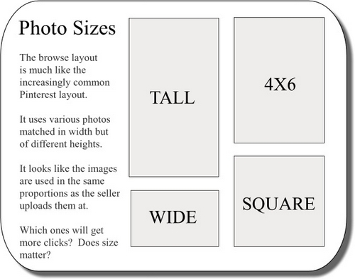
So as much as I’d love to think I’ve stumbled upon an awesome etsy hack and say “be sure to use large pictures (aka tall)”, I really don’t think that’s going to work by itself.
I don’t have much doubt that the taller images will convert better, but you can’t control which one of your images gets picked.
I think the best plan is to be able to raise your hand and say “I have that size” no matter which size the etsy supercomputer is looking for. So that means, for each item, upload a variety of sizes. Have a tall, a square, a wide, and a couple standard 4×6 sizes in both landscape and portrait orientation.
Here are a few free tools you can use for photo cropping and editing online:
- Using PicMonkey for Photo Editing
- Pixlr Tutorial (tutorial for using our free banners, but uses powerful free Pixlr website)
- Photobucket just released a new and improved design with a powerful editor
The New Etsy Infographic
What started as a few screenshots for comparison got out-of-hand… we hope it helps you visualize the important opportunities the new Etsy layout offers up to you as an Etsy seller!
Click on the graphic to see it at full-size!


Leave a Comment