We hit 18,000 85,000 (almost two years later) likes on Facebook a minute ago. Whoo hoo! What’s crazy is that we risked losing them all in one fell swoop by making a mistake on our new cover photo.
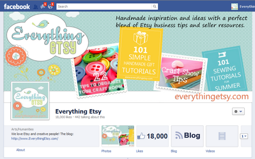
Here’s the “you get to keep your 18,000 likes” version of the new cover photo:
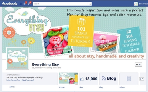
and here’s the “rebel without a clue…risk losing your page” version:

See the difference?
You must. One is a major offense!
You cannot include your website address!
Thanks to our friends for noticing!
As soon as we posted the new cover photo, some of our friends online noticed our mistake and let us know. Cathy was the first to mention it and her voice was seconded by Kelly, and Diana. All within just a few minutes, so we figured we must have goofed.
And here we are supposed to be the experts and all! Oops.
It seems like Facebook would be a little more clear about the URL, which is one of the things you would instinctively want to include. The first guidance you see says the following:
Note: This space is not meant for promotions, coupons, or advertisements. Your cover photo should not be primarily text-based or infringe on anyone else’s copyright. Learn More about choosing a cover photo.
To me when a page is for a website, including the website address is essentially the same as a company including a company name. It’s not really a “promotion, coupon, or advertisement.”
But after getting those warnings, we dug a little deeper and found this further information:
Covers may not include:
i. price or purchase information, such as “40% off” or “Download it on socialmusic.com”;
ii. contact information such as a website address, email, mailing address, or information that should go in your Page’s “About” section;
iii. references to Facebook features or actions, such as “Like” or “Share” or an arrow pointing from the cover photo to any of these features; or
iv. calls to action, such as “Get it now” or “Tell your friends.”
Whatever you say FB. You make the rules. No wave-making here.
Creative Mistakes Often Yield Better Results
The funny thing is that I like the new one better anyway. And it’s not very hard for anyone on our Facebook page to find a link to our site if they want one.
It’s so common for things that look like problems or road blocks to turn into opportunity and for creative mistakes to turn into something even better than it would have otherwise been.
Doesn’t that happen to you all the time? It does me. Maybe I just mess up more than most people!
Speaking of Creativity
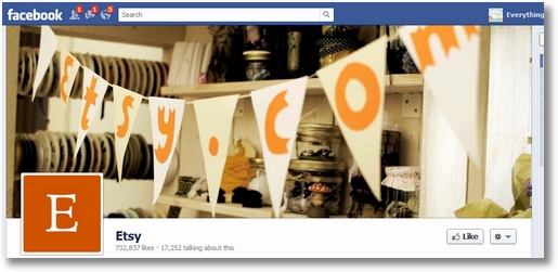
Etsy found a pretty nifty way to get by the “no url” rule. With 3/4 of a million likes, I kind of doubt Facebook is about to send them packing over this. Maybe the idea is worth a try… if you have a short enough URL. I don’t think EverythingEtsy.com would work out…

If you’re not already one of the 730K people who like Etsy on Facebook, here you go: Facebook.com/Etsy
We Love Facebook Nonetheless!
Slightly annoying rules aside, we love facebook and invite you to join us.
Here on the blog, we can have all the call to action we want. Watch…
Like Everything Etsy on Facebook!
Please, like our Facebook Page!
Get Everything Etsy updates in your timeline!
Don’t you want to be cool? Like Everything Etsy today!
Ha! That was really fun. You should try it on your blog. It will bring a smile to your day no doubt.
Any Cover Photo thoughts?
What do you think about the Facebook Cover image? How do you use yours? Put a link to your Facebook page in the comments and we’ll come visit!
Update: February 2014 — I’m thinking it’s about time we change ours out! I should add to the tips — “Keep it Fresh!”
~Kim


omg, I’m a mega offender! Thanks for the tips, I’ll be redesigning this afternoon!
http://www.facebook.com/carrielovesit
http://www.facebook.com/sweetfaeriedesigns
Don’t feel too bad, I did the EXACT same thing, and I’m grateful one of my page’s “likers” caught it and sent me the link to Facebook’s rules
I’m happy to “return the favor” as it were.
I too gave a shrug/whatever and changed my cover photo…. I agree it’s kinda silly, but when I know there is a rule, I can’t break it either lol…. here’s my page http://www.facebook.com/PrettyCoolShops
Who knew? Thanks for sharing with us your mistake! From https://www.facebook.com/floweringshrub
Wow, I know a lot of people who have links/promos in the cover photo. I think that was one of the biggest trends of the old layout – having a landing Welcome Page that would be clever and have an arrow pointing to the Like button.
Clever, Facebook, cleverrrr.
Thanks for bringing this to attention! My cover photo is just a photo of my work, no words at all, but I was considering a possible revamp. Now I know how to properly proceed – thank you!
Oh, and my FB Page is: http://www.facebook.com/pages/The-Little-Bird/201533876589109
Thanks, off to change my pages now… I just assumed that a photo and url would be fine… oops.
https://www.facebook.com/tomatotots
Cheers…
I love the new cover pages, even without the call to action…it gives me a chance to really showcase my stuff!
http://www.facebook.com/katiescharms
Wow, we had no idea! Thanks so much for sharing!
Chic Basics
Michelle & Rebecca
https://www.facebook.com/ChicBasics
I have been reading lots of articles about the new timeline and learned early on what not to do. There are some really creative ideas out there though!
Here is mine: http://www.facebook.com/vintagerenude
I like the Everything Etsy FB page. I think it reflects your site well and brings everything together nicely. I haven’t had much success with FB…although I also haven’t dedicated any serious time to it. http://www.facebook.com/pages/The-Homespun-Journal/318608141503548
I just changed my cover to match my blog and etsy. Also decided to change my profile picture to a personal picture of myself. (Had to force this one because I hate pictures of myself). Congrats on all of your likes! I have been working really hard the last few weeks on getting likes on FB and have went from 8 to 40. Still wishing for more but seem to have hit a roadblock on it this week. Have also been working on blog followers and have doubled numbers on that as well. Started a twitter and trying to get followers on that one. Twitter is going to be harder because none of my friends are on twitter. Feel free to offer up any suggestions, always looking to grow and improve. My facebook page is
http://www.facebook.com/profile.php?id=1502492022&sk=photos#!/pages/Shells-Vintage-Charm/222745554445822
I love your posts! They are so helpful and very well put together. Thank you!
I created Moo Pig’s cover photo using Adobe Illustrator.
https://www.facebook.com/MyMooPig
Seriously, I JUST made a new cover for my boutique “Sew Darn Fabulous” FB page about an hour ago. Literally, within a minute of going live, a good friend pointed out I added “From My Boutique: http://www.SewDarnFabulous.com” and that it was a no-no. She learned it from your website and sent me over here (LOVE, LOVE, LOVE this site – great, more hours being spent on the computer vs in my studio creating) Anyway, I made the edits (bummer) so if you’d like to check it out, here it is:
http://www.facebook.com/SewDarnFabulous?ref=tn_tnmn
I have some details of my products on my cover, nothing really special but it works :).
http://www.facebook.com/Lucilight
Wow – I’m glad you made this post! We’re using the Cover Art for one of my etsy teams to feature the team members – I would’ve for sure put down their etsy addresses on there! Now I’ll just put down shop names. Thanks for the heads up!! I’ll finish up the design of ours tonight
http://www.facebook.com/EtsyMom
I seriously need to design a cover photo, so far I’ve just been lazy and stuck a pic of a piece of jewelry up there… for now… lol
Thanks for the heads up! I have a product photo up on mine right now. http://www.facebook.com/esscentualalchemy
Very interesting! I just recently created a fb page for my little blog!
And I still have a lot to learn!
https://www.facebook.com/#!/adelightfulglow
I love the way the cover photo looks, but I was surprised to learn of the rules. I know of several bloggers who were caught of guard. Phew! Glad you got it fixed!
I love your new cover and wanted to say thanks for reminding us about this rule. So many rules to keep up with, but you shared it in a fun and positive way. My cover has nothing to do with my art, but I love it because my son took the photo.
http://www.facebook.com/pages/Created-by-DonnaK/141175319266891
I read this somewhere else a bit ago and have been “afraid” to move anything around on my page….but for now I am not unhappy with the way it looks. Where CAN you put your URL?
Whoops…here’s the FB page link:
http://www.facebook.com/pages/We-Made-This/228996723789294
I have come to really love the new design of facebook pages, but I am struggling with the cover photos for my page.
I can’t seem to get the photo is fit properly, even after I used your suggested measurements.
Plus I have zero knowledge of photoshop.
I would love suggestions and any helpful tips!
thanks!
http://www.facebook.com/thejewelryjar
oops! Forgot to leave my link! https://www.facebook.com/pages/Sprout-And-Blossom/137653019625456
Feel free to drop by our FB page –
http://www.facebook.com/vendzi
What a great article, I can’t wait to read more! I would love to have another visitor to my Facebook page!
https://www.facebook.com/StitchesbyLaura?ref=hl