I don’t know about you, but I am NOT a big fan of the new location of the Etsy Shop Announcement box. It really messed with my sense of symmetry! I’m going to show you how you can work with that pretty grey box and integrate it into your banner design!
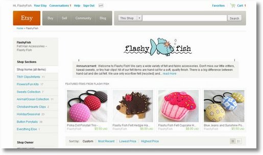
You can see the problem in the “before” picture above. By putting the announcement box directly underneath the shop banner with no white margin between them, Etsy has effectively reduced the height of usable space in your banner. The idea must be to get as much product as possible “above the fold”.
But as you can see, my artwork looks poorly centered with so much white space above, and none below. So that’s the first thing I need to fix.

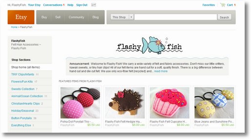
In the “in-progress” picture above, you can see that I’ve raised my artwork to the very top of my banner to create white space between the fish and the grey box. I even had to lose one bubble! The little lines you see are me trying to figure out exactly where the box is.
After a little trial and error, I found that the Shop Announcement Box is inset from the ends of the banner by about 33 pixels on each end.
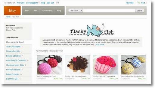
Once I figured out where the ends of the box were, I could integrate the box into my design:

Not all banner designs will make this easy work. Some are conducive to working with the box, while some absolutely are not. In this case, I think we were able to make it work pretty well. Much better than what we started with, in my humble opinion!
You can see it live on Etsy at Flashy Fish!
This is the banner itself… you can see that I just ran the grey color right to the bottom edge. The color of the Etsy Shop Announcement box is #F5F5F1
We’ve got a whole selection of free banners for your Etsy Shop on our free banners page! Check back soon for some new additions that work with the shop announcement box! We’ll be adding more this coming week.
Questions about Etsy Banners? Feel free to ask right in the comments below. I’ll answer your questions in the comments. Just don’t forget to come back and check!


Wow that is super cute!
I love how you made the wavy line with the shop announcement color! Super cute!! I’m definitely not a fan of the new announcement box either…
.-= Jan´s last blog ..Modern birth announcement – colorful banner for your baby boy =-.
Thanks for the tips!! Your shop looks great!
jewelrybyjillian.wordpress.com
.-= Jillian´s last blog ..Vintage German Glass and Gunmetal Earrings – Pavots =-.
How clever you are! Looks great!!
.-= Heather´s last blog ..Operation Reorganization- Kitchen Pantry =-.
Thank you so much! Very helpful
I don’t like the announcement section either, though I think I like it better than having a super wordy announcement take up a whole scroll’s worth of page.
Great solution to make the banners really stand out 🙂
.-= Jen´s last blog ..wordless wednesday =-.
That is so cool! I love how you integrated them and made it seem as if the announcements “belong” to the banner. That is really creative and fun!
.-= Jessica/soulenergy´s last blog ..Totally Random Internet Find =-.
That’s just brilliant. I wasn’t too bothered with the announcement thing, but now that I see that cute wavy bottom on yours, I am wanting it, too!
.-= tricia richner´s last blog ..50 Hand-punched butterfly embellishments or tags 175 inch 44cm =-.
Awesome blog!! I just stumbled across it, and think it’s great, and very informative!! 🙂
.-= Samantha´s last blog ..Love Birds Family Ornament – Custom =-.
What a great idea. I just complained about the new setup but never thought about incorporating the announcement into my banner design. Thanks so much for the tip.
Thanks for sharing this tip!!
Your header is super cute…I love what you did!
Jamie 🙂
.-= A Forest Frolic´s last blog ..More Camping Fun =-.
Love how you incorporated the shop announcement box. Your fishy may have lost a bubble, but she gained an ocean to swim in!
I reduced the height of my banner by a few pixels and made that white space (that’s gotta be done within the banner).
.-= Prairie Primitives Folk Art (Tana)´s last blog ..Autumn Leaves to Fool Mother Nature =-.