There will never be a better time than now to perfect your brand identity.
If your business is selling online, this year is looking very good for you. Online business these days is like exploring some amazing new world where every new bend in your path reveals a view bigger and better than the one before. The opportunity just keeps increasing and now is the time to take advantage of it.
A Great Logo Pays For Itself
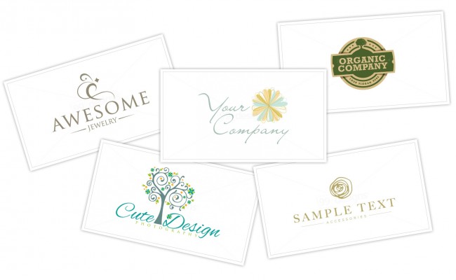
You absolutely can’t go wrong by putting some time and/or money into perfecting your branding. (aka your logo, your business cards, your packaging, your colors, etc.)
These are the very first things a potential customer is going to notice about your business once you’ve gotten their attention. The right identity will not only help you keep that attention, it will also communicate who you are in a split-second.
It’s Easier Than you Think!
Thanks to crowdsourced design sites like 99Designs you don’t need to be an expert at Photoshop or Illustrator. You don’t need to be a graphic designer or an expert on marketing trends. You don’t even have to know for sure what you want in a new look.
You don’t need a huge budget either. 99Designs offers ready-made logos for just $99.00 and will run a logo design contest for you for as low as $299! Tim’s mom used 99Designs a few times last year and was always thrilled with the results and felt like the value was incredible.
5 Elements of a Crazy Good Logo
1. Make it Readable
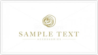
Fonts are one of my favorite things about the internet world. There are enough beautiful and creative fonts out there to keep me browsing for days on end!
Don’t be afraid of a unique font in your logo, just be sure it’s readable!
Remember, that new member of the public that just found you doesn’t know who you are. They don’t know the name of your shop and your logo should change that fact immediately and effortlessly.
2. Be Sure it’s Scaleable
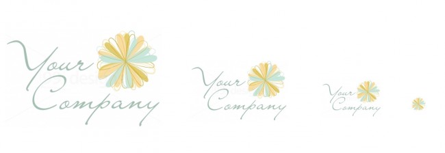
Is “scaleable” a word? In any case be sure that your logo can be shrunk pretty small and still be legible. This is important for things like ads, image watermarks/overlays, tags on packaging, website favicons, and social media accounts. If your whole logo can’t be scaled small, try to get a “mini-version” that may not have your full name but is clear at a small size.
You’ll also want to be sure you get the vector files for your logo so you can scale it as large as you want. This way when it comes time for you to put up a giant billboard, you’ll be ready! Large files are also important for high quality print work.
3. Keep Your Color Options Open
In the olden times, they said you must only accept a logo design if it worked as well in black & white as it does in color. I think that’s a throwback to the days of $5.00 per sheet color copies and no such thing as a full-color business card.
Not saying I personally remember that… I’ve just heard such a time once was. Thankfully, those days are gone.
But that doesn’t mean you want to lock yourself into using the same colors all the time. Make sure your logo looks good in a solid color on a contrasting background. This will open up countless opportunities for you as you grow your business. Simple things like landing pages, email logos, and printed tags to attach to your packaging often look great in bold but simple colors.
4. Send a Message
Logos are communication. Not only with the words your logo includes, but also with the images/shapes it includes and with the typefaces and colors you use. Know the message you want to send and pick a logo design that sends it!
Classy, Expensive, Fun, Creative, Handmade, Organic, Holistic, Therapeutic, Renewable… these are all “ideas” that can be communicated instantly through your logo. Don’t miss out on this wonderful opportunity to set the tone.
5. Be Yourself!
Have fun with your logo!
The wonderful thing about having your own business online is that it’s all you baby! You’re the one who designs, creates, markets, and delivers… so make sure your logo expresses who you are, what you love, and how you see your business. The consistency in your message over time will pay-off in a big way.
Use Your Logo Everywhere!
Once you’ve picked out your logo and have the finished files, you’ll be able to use it all over the place to create a clear and consistent image for your business!
- Etsy Shop Banner
- Website and/or Blog
- Social Media Profiles
- Advertisement Graphics
- Tags and Packaging
- On Item Images (small in the corner)
- Business Cards
- Letterhead
- Email Signatures
- Coupons
- Videos
You name it and you can easily throw your beautiful new logo on it and make this year your best yet!
If you’ve got an awesome logo you’d like to share for inspiration, leave a link to it in a comment below!
~ Kim
I had a professional logo made about a year ago for my Etsy shop: blackbelthomedecor.etsy.com. I used 99designs and had them run a logo contest for me. The ideas that the designers came up were incredible and it was so hard to choose just one, but I love the logo I finally decided on and I use it everywhere possible for my branding.
Having a readable font is so important in a logo. If people can’t read it, they won’t be able to look it up online later or anything. It’s going to be everywhere once you’ve finished it, so you want to make sure it works well on different backgrounds. I’ll have to keep this in mind while we are coming up with the design concepts.
Amazing tips. Besides editing and cropping, remove background is also very important to create a beautiful and unique logo that attracts the eye.