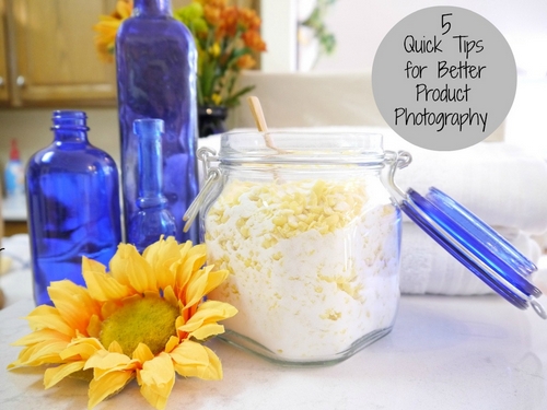
I love photography. Even though I’m not a professional photographer by any stretch, and I couldn’t really define “aperture” for you, I’m constantly looking for ways to take better product pictures for my Etsy shop, blogs, and, of course, Pinterest.
If you’re selling anything online, then getting great product photography is probably always on your to-do list. Here are a few quick tips I’ve learned over the last few years by trial-and-error and countless thousands of pictures taken.
Natural Light
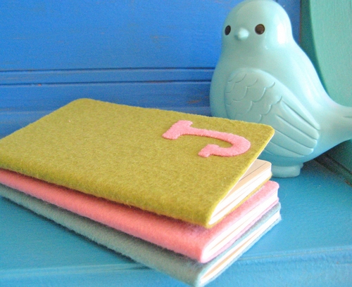
Lighting is the number one key to great shots. I have a few spots in my house where I take most of my pictures and I know exactly what times of day will yield the best results thanks to natural lighting. You’d be surprised how much difference thirty minutes on the clock can make.
Experiment with different spots in your house near windows or doors. Look for places that get light from more than one direction but aren’t too bright. Outside usually doesn’t work for me because it’s too bright and there are shadows. Shadows are not your friend.
My need for perfect lighting has recently been greatly reduced by using a mirrorless digital camera with a bright lens. If you’re in the market for a new camera try a digital single lense mirrorless (DSLM).
Close-Up Is Good
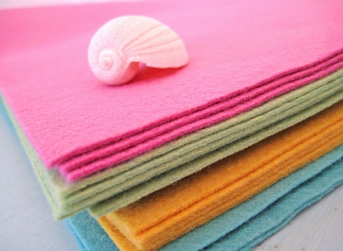
One of the most important things to remember when taking pictures for online sales is that your picture should answer the buyer’s questions. Think about what you do when you’re about to buy something in “real life” and try and provide for that experience through pictures.
The first thing most people do before they lay down their hard-earned money is to look closely. Jewelry and other small items are usually picked-up and looked at up-close. So make sure that some of your pictures are both close-in and high resolution to allow for zooming.
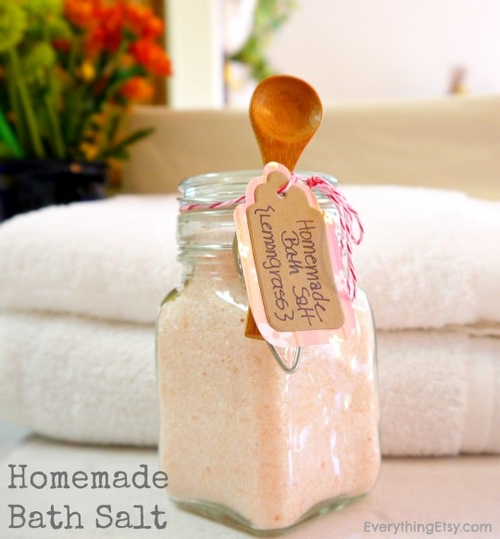
Be careful not to make the common mistake of resizing your pictures so much before uploading them that they are no longer “zoomable”. Try to upload a large enough size so that the image can fill your computer monitor, but not so big that it takes a lifetime to download. (approx 1000×1000 pixels is a good rule-of-thumb)
Try Angles
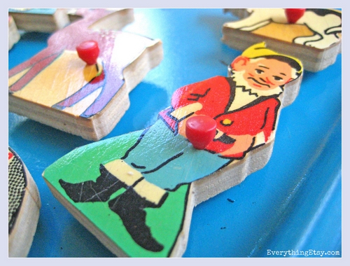
If you’re selling online, you always have the opportunity to offer your customers more than one picture of each item. My advice is to provide as many pictures as you can so your customer can spend as much time as possible with eyes on your product. The longer they look, the better your chances of getting the sale.
One of the best ways to both “answer the customer’s questions” and keep them looking at your items longer is by providing shots from multiple perspectives. An upward angle, a little to the left, now move to the right an tilt slightly back, work-it, own-it, yeah baby! Got the idea?
Mind The Background
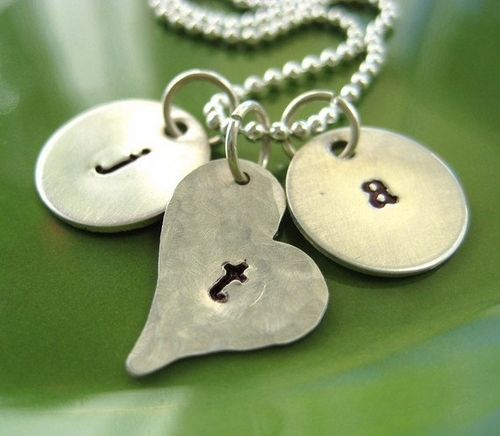
Backgrounds are important for two totally distinct reasons.
First, the background is key to making the picture look nice while simultaneously putting all the visual attention on your product, not on the background.
Second, and possibly more importantly in some settings (such as on Etsy), the background is a very important part of what your shop will look like and, by extension, what the Etsy browse pages and home page will look like.
The better your background, the better your chances of getting your items featured and the more likely people who find your shop are going to browse a bit. Think of it as the walls, ceiling and flooring in your “real world” shop. It should look good and feel good but not take the focus from your “stuff”!
Use Models or Real Life Examples
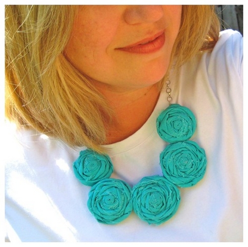
If you can, show pictures of your product in action. If you sell something wearable, that means a model or at least a mannequin. If you sell something in the home-decor market then you would want to show some pictures of only your item, then other pictures showing your item in a real-life actual use setting.
I’ve sold lots of jewelry without following this rule, so it’s possible to succeed without models, but I know from watching other sellers that models absolutely make a difference. You can also try the “self-portrait” version of modeling, as in the picture above.
The main goal is to bring your products to life by showing them in their natural environment.
Every Bad Picture is A Step Forward
Each of these tips represents a “problem” to solve, right? How do I get better lighting? Where am I going to find a model? I really need a new camera…
Never give up! First of all realize that you’re never going to be fully satisfied. The better your pictures get, the better you’ll want them to be. Also try to keep in mind that every time you take a bad shot it’s just one more step forward in your journey toward knowing what works, and what doesn’t.
It reminds me of that Thomas Edison quote: “I haven’t failed, I’ve just found 10,000 ways that don’t work.”
Keep working it and eventually you’ll have the best product pictures on the Internet! Woot.
~ Kim
This post is part of BlogHer’s Pro Photo Tips editorial series, made possible by Panasonic.
Great tips and I’m constantly trying to improve my pics. It is a struggle, but very cool when you get something right. I, unfortunately, have no natural light in my apartment, so figuring out ways to photograph has been a particular challenge.
What a great post. Such positive and practical advice!
always trying to improve my pics but its seems to be a work in progress. Thanks for the tips and ideas.
Great tips, thanks! I’m experimenting with better angles for my jewelry, it’s sure a challenge – and I’m hoping to find a good background. I’ve had a few self-portrait photos turn out ok, but this weekend I will be doing a little experimenting with my new mannequin. I’m so nervous about piercing her ears! Maybe I should have them professionally done? 🙂
Great tips. You have summed up all the things we should be remembering all the time. Now if only we could get the sun to work with us when we need it & where we need it. . .
Kim- Thank you for the very practical and easy to follow advice! I have a question for you…..if you don’t mind :0)
I love the way the necklace stands out on the green background…….would you mind telling me just what the “green” is? Whatever it is looks great really showing the detail of the item, in this case the necklace!
Also…any tips for those who sell clothes and would have a hard time using a model, as that would involve taking a baby and toddler in and out of multiple outfits for the pictures…..which ends up creating very unhappy kids, and outfits that need reironing!
Thank you!
I thought you are only able to upload 570 pix pictures on etsy. I have really struggled with redoing all my photographs to meet that size.
Background is a very important factor. If you dont want to do any post photography processing then choosing white background is safe.
Much Appreciate! Very Helpful Article for Beginners.